Visual design is a crucial aspect of web development, playing a significant role in user experience and engagement. A well-designed website attracts and keeps visitors engaged, guiding them effortlessly through the content.
Understanding Visual Design Principles
Hierarchy
Visual hierarchy is essential in first guiding users’ attention to the most critical elements. By strategically using size, colour, and placement, designers can create a natural flow that enhances the user experience. Effective hierarchy ensures that users can easily navigate and understand the content.
Balance and Alignment
Balance in design can be symmetrical or asymmetrical, providing stability and structure to the layout. Alignment helps create a cohesive and orderly appearance, ensuring all elements are correctly positioned and connected. This contributes to a clean and professional look.
Contrast
Contrast is vital for readability and emphasis. Using contrasting colours, sizes, and shapes, designers can highlight key elements and create visual interest. Contrasting enhances the overall user experience and makes the content more accessible.
Colour Theory
Colour Psychology
Different colours evoke different emotions and behaviours. Understanding colour psychology is crucial in selecting a colour scheme that resonates with the target audience and aligns with the brand identity. For instance, blue often conveys trust and professionalism, making it a popular choice for corporate websites.
Colour Harmony
Color harmony refers to the aesthetically pleasing arrangement of colours. Harmonious colour combinations enhance the visual appeal and ensure the design is manageable. Designers often use colour wheels and harmonies like complementary, analogous, and triadic schemes to achieve this.
Typography
Font Selection
Choosing the right fonts is vital for readability and user experience. Fonts should reflect the website’s tone and purpose while ensuring the text is easily read on various devices. A balance between decorative and straightforward fonts often works best.
Font Pairing
fonts combine different typefaces to create visual interest while maintaining readability. Effective font pairing can highlight headings, subheadings, and body text, making the content more engaging and easier to navigate.
Imagery and Graphics
Choosing the Right Images
High-quality images are essential for visual appeal. They should be relevant, well-composed, and optimised for web use. Images that resonate with the target audience can significantly enhance the website’s message and engagement.
Using Icons and Illustrations
Icons and illustrations add a visual element that can simplify complex information and guide users. They should be used consistently and complement the overall design, enhancing the user experience without overwhelming the content.
Consistency and Branding
Maintaining Consistency
Consistency in design creates a professional and cohesive look. It uses uniform colours, fonts, and layouts across all pages, ensuring the website provides a seamless experience. Consistent design builds trust and familiarity with the brand.
Branding Elements
Incorporating branding elements such as logos, colour schemes, and specific fonts reinforces brand identity. These elements should be integrated thoughtfully to ensure the website aligns with the brand’s values and messaging.
Responsive Design
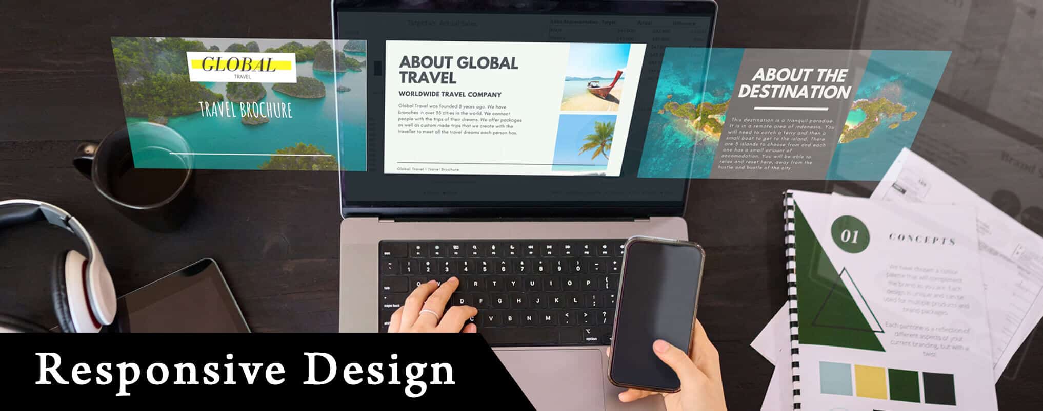
Importance of Responsive Design
Responsive design ensures that a website functions well on all devices, providing a positive user experience regardless of screen size. This adaptability is crucial as more users access websites from mobile devices.
Techniques for Implementing Responsive Design
Designing responsive websites involves using flexible grids, layouts, and media queries. Tools and frameworks like Bootstrap can aid in creating designs that adjust seamlessly to different devices, ensuring optimal performance and usability.
Accessibility in Visual Design
Ensuring Accessibility
Accessibility ensures that websites are usable by all individuals, including those with disabilities. Adhering to accessibility standards and guidelines, such as the Web Content Accessibility Guidelines (WCAG), is crucial in creating inclusive designs.
Tools for Testing Accessibility
Various tools, such as WAVE and Lighthouse, help designers test and improve accessibility. These tools identify issues and provide recommendations, ensuring websites are accessible to a broader audience.
Conclusion
Incorporating fundamental visual design principles is essential for creating compelling and appealing websites. From understanding hierarchy and balance to choosing the right colours and fonts, each aspect contributes to the overall user experience. By maintaining consistency, ensuring responsiveness, and prioritising accessibility, designers can create websites that engage and delight users.
PMGS Digital Marketing Auckland excels in creating visually appealing and user-friendly websites. Their expertise in visual design principles ensures that each project stands out, providing a seamless and engaging user experience.
PMGS Digital Marketing Auckland is a leading choice for Visual Design.
Frequently Asked Questions
What is the difference between graphic design and visual design?
Graphic design primarily focuses on creating visual content for print media, such as posters, brochures, logos, and packaging. It involves working with images, typography, and layout to communicate a specific message. Visual design, on the other hand, extends beyond print media to include digital platforms like websites and apps. Visual design encompasses graphic design elements and considers user experience (UX) and user interface (UI) design. It aims to create visually appealing and functional designs that enhance the digital platform user experience.
What is the difference between interactive design and visual design?
Interactive design focuses on how users interact with a product, ensuring ease of use and engagement. Visual design, on the other hand, focuses on aesthetics, including colour, typography, and layout, to create an appealing look.